Keytrends AI content marketing suite v2.13
Tabla de Contenidos
Analytics. This is the word that could define all the changes and improvements that we have introduced in this new version of the platform and that will allow you to plan a better strategy.
Better, in two ways: on the one hand, because you will have much more data to prioritise which topics and trends to cover; on the other hand, because by basing your decisions on data, you will create content that will generate sure results, faster.
With this new version we are closer than ever to data-driven content strategies 💣. Read on, and you’ll understand.
1️⃣ New trend data to see how your topics are evolving
We start with one of the improvements we’ve been wanting to implement for a long time, so that you can make a more complete analysis of your topics, in My Topics. These are new data columns that you can turn on and off in your topic display table:
- Period columns: visualise the evolution of the interest graph of a trend in your table. You can activate it for 5 years, 1 year, 90 days, 30 days, and 1 week.
- Percentage change columns: check the variation in the growth of that theme from one time period to another. You can activate the HOH (Hour over hour change), the DOD (Day over day change), the WOW (Week over week change), the MOM (Month over month change) and the YOY (Year over year change). In other words: from one day to the next, from one week to the next, from one month to the next and from one year to the next.
You can see them in this screenshot:
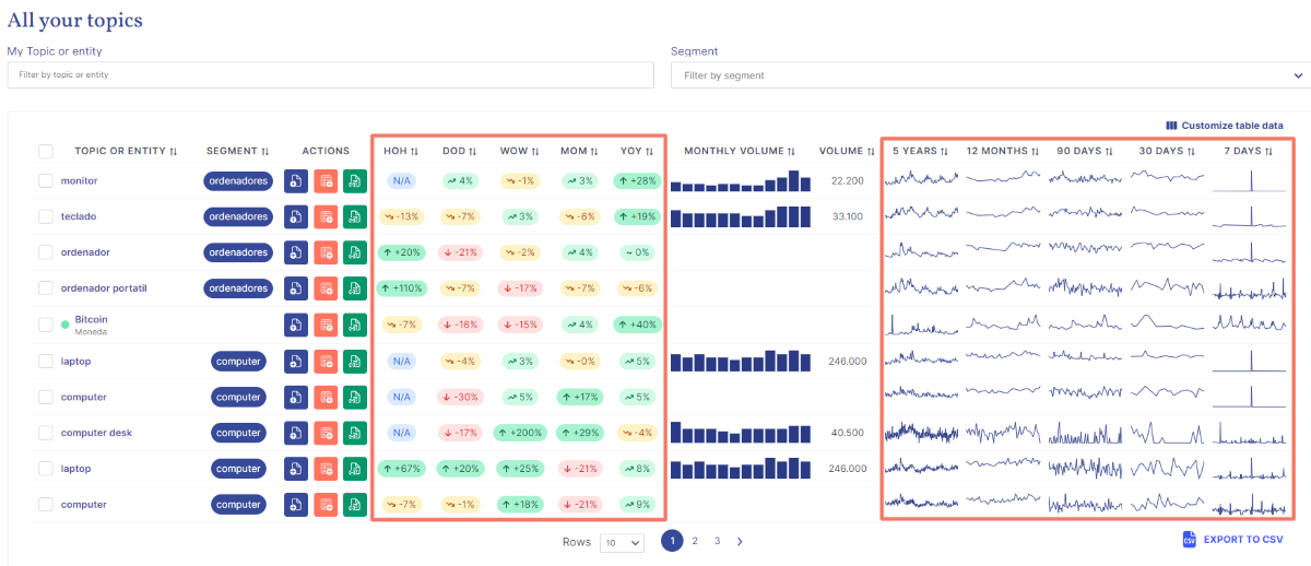
With this data, we want to help you identify trends over time and understand how a topic has evolved from one year to the next. You can then make data-driven decisions to prioritise your content 😉.
2️⃣ 3 powerful new filters to analyse your Search Console data
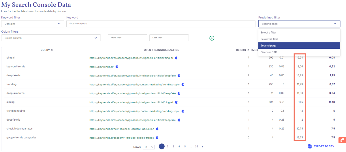
Our particular version of the Google tool already allowed you to do much more thanks to the filters. Now, we accelerate the process of analysing and detecting opportunities for improvement in your already published content with 3 more filters:
- Below the fold: filter by your pages that are below the above the fold or Top3 on the first page of SERPs.
- Second page: visualise your URLS that are on the second page of Google results, beyond the 10th position.
- Discover CTR: see your content that has been clicked on in Discover.
Are they or are they not a shortcut to create your re-optimisation strategy? In this example you can see how we have selected the second filter to see all the pages that have failed to rank on the first page of results:
3️⃣ New topics performance sections to prioritise your topics
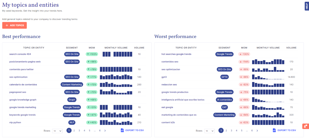
This is one of the great additions of this 2.13 version: being able to know which configured topics (or entities) are having the greatest growth in order to prioritise covering the trends or queries that arise around that topic or segment.
🟢 You can find this in Best performance, and it shows you the topics that have performed best from one month to the next in percentage growth with the positive monthly trend graph next to it.
🔴 And, on the other hand, you will also have a clear idea of those that are not performing so well in order to discard them. You have this in Worst performance, which shows you the topics that are performing worst and therefore have negative percentages.
Now comes the best part: by clicking on any topic or entity you will be able to see all its change or evolution data, and all the related trends without having to dive into the Trends section. The advantages of this 👇?
✔️ You see both the queries or trends that are growing (Growing) and the ones that have grown the most (Top), for your specific topic.
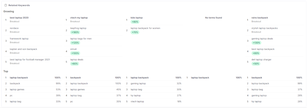
✔️ Know the DOD (Day over day change), the WOW (Week over week change), the MOM (Month over month change) and the YOY (Year over year change) of that specific topic.
✔️ You check its seasonality with the 5 graphs of interest, one for each period: 5 years, 1 year, 90 days, 30 days, and 1 week.
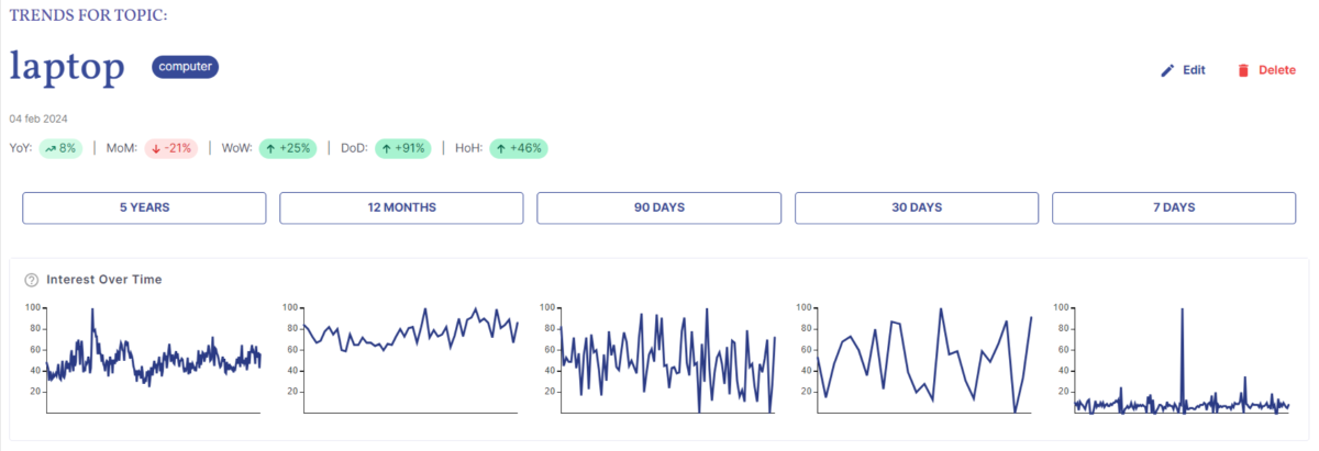
💡 If you are interested in focusing on a specific period, click on it and you will also have all this data (growing and top queries, percentage change and interest by region).
✔️ You visualise the interest of that topic or entity by region of the configured country, with a map for each time period:
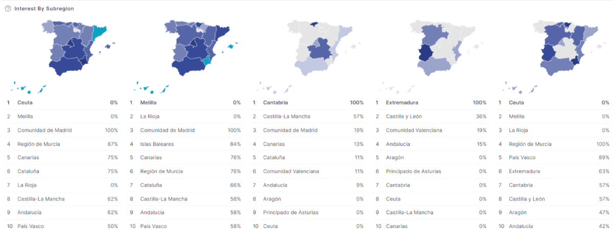
With all this information you can accurately define the seasonality of the topic, see which related queries or trends are worth covering, and decide whether to create local content for one or several specific geographic areas.
These are the main highlights of our v2.13, but you can read about the minor improvements and fixed bugs in the general release notes.
Let us know any questions you may have in the comments, send us an e-mail or book a 30 minutes demo you can show you all the new features! 👇
